

The colour separations can be viewed at the print menu under 'Output.'

Make sure that the document is printed with the appropriate bleed marks and crop marks. These can be selected when you go to print the document.
Preparing images on In Design
From Photoshop
- The image must be in CMYK, Greyscale or Monotone
- It must be the actual size that it needs to be for the In design document
- The resolution of the image must be 300 dpi.
- The image must be saved either as a PSD or TIF file.
- Adobe Illustrator also works in CMYK
- The resolution of the image does not need to be considered as it is vector based.
- The format of the file can be AI or the image can be dragged into the open document.
- In design uses low resolution images. so they may look blurry on the screen but as long as they are 300 dpi they will print fine.
- Make sure that any images you are using are saved in the same folder as the document save, other wise In design will not be able to find the images.


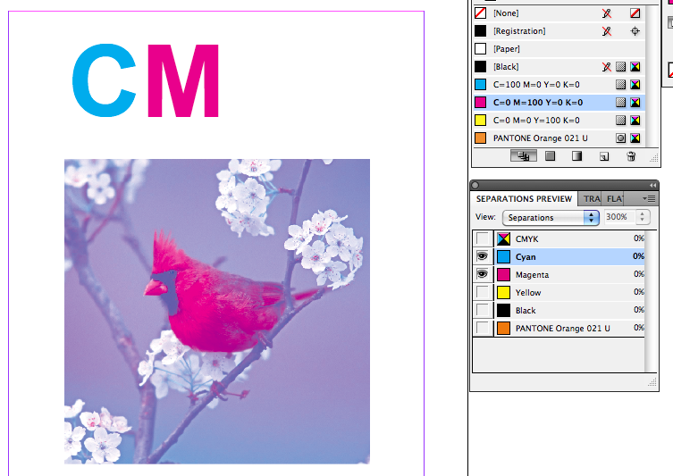
Above are the different variations of visible colours.

This is the colour separations palette. The eye next to a colour means that it has been made visible.


From here we can see the different types of colour accordingly.


In order to see what colours you want to print, we need to go the separations preview. This is obtained by going
Window > Output > Separations menu


We can also do the same thing with a spot colour. This can be very useful if you are importing match spot colours from Illustrator or Photoshop.


The new green is now saved to my palette.


After having created a new swatch, we can then change the CMYK values to what ever we please. There is also an option to change the tint as well. After the colour ha been changed we can then save it to the swatch palette.


After you have applied colour to the text we can use this piece of the palette to switc between the text colour and the background colour.

Next we were asked to type the word 'TEXT' and layer it over the top.


We were then asked to produce a box of colour using then image tool.

This is the document with the guidelines turned off.

This is the document with the guide lines turned on.

To begin we open up in design from the dock. We are then met with the new document window. We were asked to produce a single page document with three columns. As the document was only a single page I turned facing pages off because this is only required if you are producing a document like a book or leaflet.
No comments:
Post a Comment