Showing posts with label OUGD201. Show all posts

Monday, 15 November 2010

Sunday, 14 November 2010

Saturday, 13 November 2010

Wednesday, 10 November 2010

Tuesday, 26 October 2010

Mechanix Illustrated


Mechanix Illustrated was an American magazine founded in the first half of the 20th Century to compete against the older Popular science and Popular Mechanics Billed as "The How-To-Do Magazine," Mechanix Illustrated (MI) aimed to guide readers through various projects from home improvements and advice on repairs to "build-your-own (sports car, telescope, helicopter, etc)." From its debut in 1928, it went through a number of permutations over the years, being called at various points in its life, Home Mechanix, Modern Mechanics and Inventions, Modern Mechanix and Inventions, Modern Mechanix and finally Mechanix Illustrated.


here are some covers of Mechanix Illustrated. This kind of dawing and creativity is something that I really want to see in my work for this module.

The cross sections of the objects are shown on an incredibly detailed level and they also please the eye aesthetically. The old school grainy print also gives the work a lot of charm and character. This warmth will be something that I will try and achieve with my work also.


Monday, 25 October 2010

Feedback From Crit

After a crit, I decided that my good was too scattered and not focused enough.

I decided to look at my 'good' and re evaluate what i liked about it.

So what is good?

- PREDICTING THE FUTURE.

eg. 1950's retro futurism. In the 1950's they made predictions that we would have flying cars and that there could be possibly colony's on the moon.

I want to produce designs similar to this, but from 2010 looking into 2050 or maybe later.

After talking to Lorenzo, he gave me the idea of producing a range of products that came under different categories. For Example.

- COMMUNICATIONS
- TECHNOLOGY
- MOTORSPORT
- WEAPONARY
- MILITARY
- FASHION
- ARCHITECTURE
- INDUSTRY
- ADVERTISEMENT
- SPORT
- SOCIALISING
- EDUCATION
- PUBLIC TRANSPORT
- MUSIC
- ENVIRONMENT

I also had the idea that I could use a range of printing techniques to show my ideas ranging from blueprint's to printing on clear acetate.
I thought that putting my ideas and designs in a time capsule would also be really good way of encompassing them all together as one unit of work. This would also give me a chance to play around with printing techniques such as embossing.

My target audience is also something that i would have to take into consideration.

WHO ARE THE TARGET AUDIENCE?

- The target audience could either be people who are my age in 2050 (so roughly 70) or they could be students design students of 2050.

- As I am placing my designs in a time capsule I would like students in 50 years time to look at my designs and have the same experience I did when i looked at the the ideas of the future from the 1950's. I would prefer this because it would give them a better in sight into the past and get them to think about the future, hence forth broadening their minds to the concept.

Saturday, 23 October 2010

In Design Session


The colour separations can be viewed at the print menu under 'Output.'


Make sure that the document is printed with the appropriate bleed marks and crop marks. These can be selected when you go to print the document.

Preparing images on In Design

From Photoshop
  • The image must be in CMYK, Greyscale or Monotone
  • It must be the actual size that it needs to be for the In design document
  • The resolution of the image must be 300 dpi.
  • The image must be saved either as a PSD or TIF file.
From Illustrator
  • Adobe Illustrator also works in CMYK
  • The resolution of the image does not need to be considered as it is vector based.
  • The format of the file can be AI or the image can be dragged into the open document.
In Design tips when sending to print
  • In design uses low resolution images. so they may look blurry on the screen but as long as they are 300 dpi they will print fine.
  • Make sure that any images you are using are saved in the same folder as the document save, other wise In design will not be able to find the images.


Above are the different variations of visible colours.


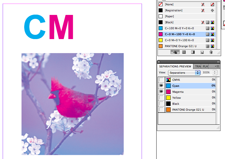
This is the colour separations palette. The eye next to a colour means that it has been made visible.


From here we can see the different types of colour accordingly.


In order to see what colours you want to print, we need to go the separations preview. This is obtained by going

Window > Output > Separations menu


We can also do the same thing with a spot colour. This can be very useful if you are importing match spot colours from Illustrator or Photoshop.


The new green is now saved to my palette.


After having created a new swatch, we can then change the CMYK values to what ever we please. There is also an option to change the tint as well. After the colour ha been changed we can then save it to the swatch palette.


After you have applied colour to the text we can use this piece of the palette to switc between the text colour and the background colour.


Next we were asked to type the word 'TEXT' and layer it over the top.


We were then asked to produce a box of colour using then image tool.


This is the document with the guidelines turned off.


This is the document with the guide lines turned on.


To begin we open up in design from the dock. We are then met with the new document window. We were asked to produce a single page document with three columns. As the document was only a single page I turned facing pages off because this is only required if you are producing a document like a book or leaflet.